My roles
Design system designer
Platforms
Web
Date
Sep. 2022 – Feb. 2024

Before starting the redesign, it was important to clarify whether the current navigation truly failed to meet user and business needs. I engaged stakeholders, asked critical questions, and gathered requirements to uncover the underlying issues. Here’s what emerged:
Before moving into design, it was critical to revisit who our clients are and what contexts they operate in. A clear understanding of the audience ensures that the navigation is not only functional, but also aligned with their real needs and behaviors. Without this foundation, any solution would risk being superficial
As a final step, I analyzed competitors not only in banking but also in e-commerce and social platforms. This cross-industry view revealed best practices that shaped our design decisions. Here’s what we found:
First concepts & tests
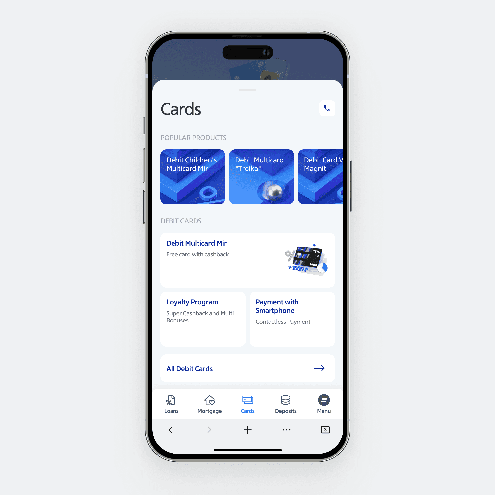
In the early iterations, I experimented with card layouts inside sections, starting with a bento-style approach and exploring different tab bar configurations.
To validate these ideas, I ran A/B tests with Pathway, combined with open-ended questions, task scenarios, and heatmap analysis. This helped refine the structure, highlight the most engaging options, and reveal how users actually interacted with the navigation


Refined iteration
In later iterations, I shaped a more balanced yet distinctive tab bar, refining visual hierarchy to emphasize the most important offers. I also experimented with interaction patterns such as horizontal sliders and expandable cards to keep navigation dynamic and engaging

Naturally, the process wasn’t without obstacles. Since the tab bar had never existed in the product before, i had to identify missing patterns and reinvent solutions to address them

Layer & popup conflicts
Since the tab bar had never existed in the product, the first major challenge was handling conflicts with overlays — modals, pop-ups, and tooltips. These interaction patterns had to be rethought from the ground up to work seamlessly with the new navigation
Multiple sections
Another challenge was scale: 14 sections for retail clients plus extra controls (dark mode, product type switch). To keep the tab bar focused, these were moved into the burger menu, which became the hub for extended navigation


Dynamic tab switching
A further challenge was dynamic tab replacement: tabs had to adapt to different client types and product contexts. For example, switching from individual to self-employed users or from retail to premium required unique offers and themes. This meant accounting for numerous edge cases across sections and audiences
At the final stage, we tested two navigation concepts using SUPR-Q. Participants were split into two groups: those who visited the site within the last 60 days and those who hadn’t engaged for over six months.
In remote calls, they completed tasks and shared feedback on clarity, difficulty, and visual appeal — giving us a clear basis for decision-making
Testing confirmed the expandable-cards concept as more modern and engaging. With data in hand, I defended it to stakeholders, documented the solution, and prepared for launch with the team.
After release, we saw the following results: